As I'm sure some have heard, the 2011 season will be the final season for the Florida Marlins, next season the team will be rebranded as the Miami Marlins and will move into their new stadium in downtown Miami complete with a retractable dome.
Now with the new stadium, the team decided that it was time to reboot the entire team much like the way the Tampa Bay Rays and the Arizona Diamondbacks did; change the uniforms 100%. The Florida Marlins are different however, being that they are getting up there in age a little and have had an established logo that hasn't been ignored by many merchandise producers or consumers, but the team felt that it was time to make a change to start new in their brand new ballpark.
The new logo shown here has been extremely controversial when it comes to its design, many people don't like it and believe it to look more like a football or college logo. It is hard to believe that Miami would just throw this together without putting some deep seeded thought into it, plus this is Miami so what else were we to expect?
The Florida Marlins will be getting brand new caps, we all know this, but what they look like is still up in question, but there has been a lot of speculation over what the caps would look like. The basic designs appear to be the logo seen above, simply slapped onto a New Era cap, but I have to believe these will not be what the caps actually do look like. I would believe it to be extremely uninteresting to take the team's primary logo and slap it onto the hat, but that is what most teams do so maybe Miami will do something traditional for once.
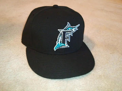
Now we won't know what the Marlins new caps will look like until 11-11-11, so until then I decided that it may be time for me to pick up one of the Marlins current ballcaps, since it will be retired after the end of the season. I wouldn't be surprised if the cap is all ready discontinued, but regardless it was a great buy for me to make. While walking into the local sports store at my mall, I started to poke around the Marlins caps and located one without the sticker in my size, so I decided to rescue it because no one would likely buy it due to its lack of sticker.
When I got the cap home, I really got to looking to it and finally appreciated this cap for what it is. I never really cared for "the fish" before and thought it was an overall uninteresting cap, however I was wrong. The cap has very strong and in depth embroidery, it displays elements of both complexity and simplicity in the same logo, and they flow together beautifully. One thing that always bothered me about the cap from a distance was that the base of the cap was just straight black, I always thought that it was just bland and was missing something. I'm still not convinced that it was missing something though, but the black base cap really makes the logo pop.
This cap is highly recommended for two reasons:
7/10
1. The logo and design is extremely unique, and it is a dying breed. The metallic thread makes the accurately designed Marlin really stick out, and the mixture of threading on the fish makes it a great work of embroidery.
2. It's discontinued, so buy it before it's gone.


No comments:
Post a Comment