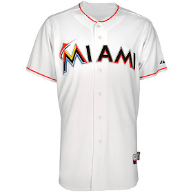
As of this afternoon, the Florida Marlins have now officially become the Miami Marlins, and a new era for this team shall begin.
The New Era caps will look very much the same as the leaked cap that showed up on Sunday, October 30th. The only difference is that we get to see what the alternate/road cap will look like, it appears to have the exact same logo on the front but the base cap is a bright orange. According to the photos below, the orange cap is extremely bright, but I won’t know for certain until I have one in my hands and have pictures for my viewers.
Home
Away
The jerseys were also officially announced today and the 2012 Miami Marlins will have four jersey tops to go along with them during the 162 game season. The Marlins appear to have a traditional home and away setup, and have two alternates for home and away play. The jerseys appear to be all the same except for the away and black alternate, both of which contain the Marlins script instead of Miami, which is extremely odd being that generally teams wear their team's location on their away jerseys instead of their home. Another change that occurs on these jerseys is that the stylized fish on the orange alternate has been moved over from the “M,” and I see no explanation for this. I think that the jerseys are all on the right track, but the script on all of them appears to be way off and needs some alteration which I am sure we will see in a year or so.
Home
Away
Home/Away Alternate 1
Home/Away Alternate 2
The batting practice uniforms appear to be just as we’d expect, but these actually turn out fairly nice with the orange stripes under the armpits. After viewing the Game Day jerseys and caps above, these appear to be simple alterations which were made to fit the Batting Practice style.
Batting Practice Cap
Batting Practice Jersey
So what are everyone's thoughts on the rebranding now that it's official? Please comment below!


Those look good. Great design.
ReplyDeleteTo be honest I really hated on the new Marlins logo. I still don't have much love for the black hat. But I kinda like the orange lid....Is that gross!?
ReplyDelete