Pages
▼
Monday, January 23, 2012
Cleveland Indians Road/Alternate
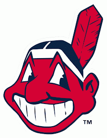
The Cleveland Indians have had a long history involving their logo of Chief Wahoo which is a caricature of a Native American which originated as a shoulder patch in 1928 but was not worn on the cap until 1954-1957 before it was used primarily starting with the 1986 season. Chief Wahoo has been a deep part of the Cleveland Indians' team history, but its presence has not been perceived well by a portion of the Native American population which has lead to several protests which started on opening day of the infamous 1994 season.
Prior to the use of Chief Wahoo in any incarnation, the Cleveland Indians wore simple blue caps with a block style white “C” located on the front panels, and starting with the 2008 season the Cleveland Indians began to wear a cap similar to the original, but reported by the Indians' president the decision was not to combat the possible racism expressed by the logo, but was to help the team's image by not wearing the logo primarily on the road and to give the fans a cap option if they were not comfortable wearing the Chief Wahoo logo.
Whereas Chief Wahoo is worn primarily at home this new New Era cap was designed and worn starting in the 2008 season as a Home Alternate, but starting with the 2011 season this cap was retired for Home Alternate use and was then used primarily as the Away cap and Chief Wahoo was then the alternate. This cap is a base Navy Blue which is surprisingly darker than the traditional Heather Grey in which they wear as a home with a scarlet brim or the away alternate which is solid Heather Grey.
The reason that the caps use two different colour blues is a mystery to me, but the choices may have had something to do with the focus of the main logo through the background choice, and this can be noted in some of the original Chief Wahoo caps using an almost-black material that made the logo really pop out with its flat embroidery, but the lighter colour allows it to blend in slightly better. The darker Navy used on this Away/Alternate cap most likely utilized the darker colour to compliment the raised embroidery to give the stylized “C” the powerful look it required without any kind of outline, much like the correlation between the Boston Red Sox and the New York Yankees cap script.
This Cleveland Indians New Era cap is designed with a stylized block “C” logo that is embroidered in scarlet stitching. This raised embroidery is thick and powerful which allows itself to become the dominant element of the cap through the process of putting the focus on the central script while using modest colour choices which compliment the team's dominant scheme which have been used somewhat exclusively since the team was named the Indians in 1915. By looking back to the teams roots of the very early years, the team has effectively made a throwback cap while at the same time modernizing it much like the Toronto Blue Jays recently did, but through using script rather than a pictorial logo.
The rear batterman logo falls into the category of “navy blue and red” which allows the logo to be a direct copy of the traditional MLB logo rather than the team's designers having the opportunity to be relatively creative by using colours that do not necessarily reflect the primary colours of the team. The logo on the back of this cap does fit in very well with the design of the cap by using a subtle design in a powerful way.
When the Cleveland Indians began to wear this cap as an alternate Home cap in 2008, it was a little frustrating to me due to the fact that being a baseball fan I am extremely against any real kind of change to teams or a change that would remove any historical aspect, and I assumed this logo was made to slowly phase out the Chief Wahoo logo. The basic fact about the Chief Wahoo logo is that it wasn't up until fairly recently in baseball history that they began to use it exclusively on their caps, but looking back at older baseball cards of mine I began to recall the stylized “C” logo which looked like Native American text in itself, and after a little more research I was able to discover that the “C” logos have dominated the team's cap throughout its history.
Whether the new “C” Logos replace the old Chief Wahoo logo is fine with me at the time being, but that being said I would prefer to see the Chief Wahoo logo stay within the team's uniform through the Home Cap, and Alternate cap, or the use of a shoulder patch as it was originally intended. When it comes down to it the logo in itself can easily be seen as being racist when looking at it without the filter we all might have, the caricature look does exaggerate some elements of the Native American but does not do it in a malicious manner. The best way to really make a good correlation would be the Atlanta Braves who no longer use their Native American caricatures but still heavily use Native American elements.
Looking at the Indians' Chief Wahoo logo while comparing it to dozens of other caps worn in the minor leagues, it is hard to see why the logo would be considered racist due to the level of caricatures used throughout the design process. Polls state that 91% of Native Americans approve or don't mind the Chief Wahoo or Washington Redskins team names or logos, but does that make it right? Or should lumberjacks nationwide all be offended by the Williamsport Crosscutters' logo?


No comments:
Post a Comment