Showing posts with label Miami. Show all posts
Showing posts with label Miami. Show all posts
Tuesday, December 20, 2011
Miami Marlins Road
I apologize for not posting in a few days, but I have been doing finals at school and whatnot, now that they are all done I'll have more time to put towards my blog.
As we all know the Florida Marlins are a thing of the past and the Miami Marlins have become the new force to be reckoned with in the National League East. With the change we saw some pretty drastic uniform alterations which completely changed their colour scheme from a Black and Teal oriented scheme to something much more “Miami.”
When the caps came out I looked everywhere for them in stores and online, but unfortunately only the flagship stores and local Florida locations were able to get them, and slowly they trickled out to stores such as Lids by November but hit the online MLB Shop stores by October, and through the internet I was able to acquire the Away Cap.
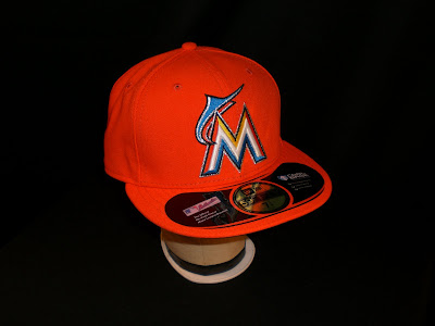
The Away Cap for the Miami Marlins is a base Orange which New Era describes as “Mandarin,” and the logo on the front is one of the few MLB logos to cover quite a large portion of the front two panels. The “M” is in an art deco style which is a solid white raised embroidered “M” outlined with yellow, blue, and orange which is then outlined with a thin later of black and a similar layer of silver. Coming out of the side of the script and raising above it is the Marlin's new incarnation of the fish that is completed with the same silver and black embroidery, but only inverted.
When the Marlins had announced that they were changing uniforms and displayed a few teaser images I can say that I wasn't impressed, but when the final result was leaked I thought it was quite interesting and looked great on a New Era Cap. The Road Cap differs from the home by the base colour only, and personally I think that this cap is just too orange and will be used as either an alternative or retired in a few years; black will be the dominant colour in South Florida.
Labels:
2012,
baseball,
embroidery,
fitted,
hats,
major league baseball,
Marlins,
Miami,
mlb,
new era,
rebranding
Friday, November 11, 2011
2012 Miami Marlins Official Release
As of this afternoon, the Florida Marlins have now officially become the Miami Marlins, and a new era for this team shall begin.
The New Era caps will look very much the same as the leaked cap that showed up on Sunday, October 30th. The only difference is that we get to see what the alternate/road cap will look like, it appears to have the exact same logo on the front but the base cap is a bright orange. According to the photos below, the orange cap is extremely bright, but I won’t know for certain until I have one in my hands and have pictures for my viewers.
Home
Away
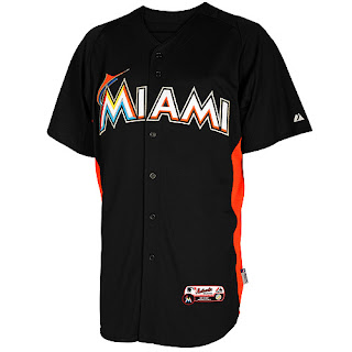
The jerseys were also officially announced today and the 2012 Miami Marlins will have four jersey tops to go along with them during the 162 game season. The Marlins appear to have a traditional home and away setup, and have two alternates for home and away play. The jerseys appear to be all the same except for the away and black alternate, both of which contain the Marlins script instead of Miami, which is extremely odd being that generally teams wear their team's location on their away jerseys instead of their home. Another change that occurs on these jerseys is that the stylized fish on the orange alternate has been moved over from the “M,” and I see no explanation for this. I think that the jerseys are all on the right track, but the script on all of them appears to be way off and needs some alteration which I am sure we will see in a year or so.
Home
Away
Home/Away Alternate 1
Home/Away Alternate 2
The batting practice uniforms appear to be just as we’d expect, but these actually turn out fairly nice with the orange stripes under the armpits. After viewing the Game Day jerseys and caps above, these appear to be simple alterations which were made to fit the Batting Practice style.
Batting Practice Cap
Batting Practice Jersey
So what are everyone's thoughts on the rebranding now that it's official? Please comment below!
Labels:
2012,
baseball,
caps,
embroidery,
fitted,
Florida,
hats,
jerseys,
major league baseball,
Marlins,
Miami,
mlb,
rebranding
Sunday, October 30, 2011
*Leaked* Miami Marlins New Era
The Miami Marlins new New Era caps have been unofficially released, as it appears according to George Richards of the Miami Herald after posting some pictures to the website after catching the Marlins new cap prior to its official release. Here are some leaked photos of what could be the new Miami Marlins cap for the 2012 season, should all of the speculation go unchanged. The cap seen below appeared to have been located at the New Era store in Buffalo, New York, the very city that New Era spawned from, so that leads us to believe that these caps are 100% authentic and are not preconceived replicas.
One could say that this cap is a prototype, which to me could be true or could not be true, being that the knowledge of if the cap is currently being sold in the store is up to question and debate, the only way to know for sure is to go there and check it out; Richardson's testimony appeared to give insight that the cap was for sale when he acquired it. All that can say is that it shouldn’t be a surprise to anyone that the cap surfaced in the very city where New Era is located, Buffalo.
The cap unfortunately wasn’t supposed to be seen by the public’s eyes until November 11th, 2011 when the Miami transition is finalized, but this leak apparently has shed some light on what the new caps will look like. Several weeks ago the Marlins announced their new logo, and this cap appears to be a direct copy of that even down to the background colour, so there really should be no surprises here.
As assumed, this hat would most likely be the Marlins Home Cap, and there could be several more in the near future. An Alternate and an Away Cap are the most likely suspects when looking into more caps being released, I personally foresee an away cap and two alternates, but the only way we will find out is either wait for more leaks for listen for the news on November 11th.
The photos seen here were taken by Miami Herald Sports Writer, George Richards, on an apparent trip up to Buffalo; the images were uploaded to the Miami Herald late last night.
Labels:
embroidery,
fitted,
Florida,
hats,
Leaked,
major league baseball,
Marlins,
Miami,
mlb,
rebranding,
relocation
Saturday, October 22, 2011
Florida Marlins 1996 - 2011
As I'm sure some have heard, the 2011 season will be the final season for the Florida Marlins, next season the team will be rebranded as the Miami Marlins and will move into their new stadium in downtown Miami complete with a retractable dome.
Now with the new stadium, the team decided that it was time to reboot the entire team much like the way the Tampa Bay Rays and the Arizona Diamondbacks did; change the uniforms 100%. The Florida Marlins are different however, being that they are getting up there in age a little and have had an established logo that hasn't been ignored by many merchandise producers or consumers, but the team felt that it was time to make a change to start new in their brand new ballpark.
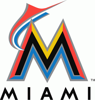
The new logo shown here has been extremely controversial when it comes to its design, many people don't like it and believe it to look more like a football or college logo. It is hard to believe that Miami would just throw this together without putting some deep seeded thought into it, plus this is Miami so what else were we to expect?
The Florida Marlins will be getting brand new caps, we all know this, but what they look like is still up in question, but there has been a lot of speculation over what the caps would look like. The basic designs appear to be the logo seen above, simply slapped onto a New Era cap, but I have to believe these will not be what the caps actually do look like. I would believe it to be extremely uninteresting to take the team's primary logo and slap it onto the hat, but that is what most teams do so maybe Miami will do something traditional for once.
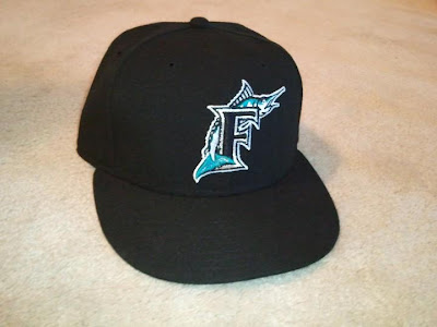
Now we won't know what the Marlins new caps will look like until 11-11-11, so until then I decided that it may be time for me to pick up one of the Marlins current ballcaps, since it will be retired after the end of the season. I wouldn't be surprised if the cap is all ready discontinued, but regardless it was a great buy for me to make. While walking into the local sports store at my mall, I started to poke around the Marlins caps and located one without the sticker in my size, so I decided to rescue it because no one would likely buy it due to its lack of sticker.
When I got the cap home, I really got to looking to it and finally appreciated this cap for what it is. I never really cared for "the fish" before and thought it was an overall uninteresting cap, however I was wrong. The cap has very strong and in depth embroidery, it displays elements of both complexity and simplicity in the same logo, and they flow together beautifully. One thing that always bothered me about the cap from a distance was that the base of the cap was just straight black, I always thought that it was just bland and was missing something. I'm still not convinced that it was missing something though, but the black base cap really makes the logo pop.
This cap is highly recommended for two reasons:
7/10
1. The logo and design is extremely unique, and it is a dying breed. The metallic thread makes the accurately designed Marlin really stick out, and the mixture of threading on the fish makes it a great work of embroidery.
2. It's discontinued, so buy it before it's gone.
Labels:
baseball,
caps,
Florida,
hats,
major league baseball,
Marlins,
Miami,
mlb,
new era,
rebranding,
stadium
Subscribe to:
Posts (Atom)


