Showing posts with label Stars and Stripes. Show all posts
Thursday, February 23, 2012
Milwaukee Brewers Military Appreciation Day
After hunting for obscure On-Fields such as the 2010 Tampa Bay b”RAYS”ers I have stumbled upon a cap that I had forgotten to be in existence, and that is the 2011 Milwaukee Brewers Military Appreciation Day On-Field Cap.
Without owning this cap first hand from a distance the only real constant between this cap and the Official On-Field is the Heather Grey crown, but other than that the colours have obviously been altered to satisfy the Military Appreciation Day celebration. Without knowing for sure due to the picture provided I would have to guess that the camouflage pattern used is U.S. Woodland, but it could be another similar pattern because I assume that each cap is unique with the pattern, meaning that no cap appears the same as it comes off of the factory line.
The logo of the cap is just the same as the On-Field Fitted but as expected the colours are vastly different, also to cater to the Military Appreciation Day theme, but the contrast between the camouflage and Heather Grey crown doesn’t translate that efficiently, and the cap is more than likely one of the worst On-Field Fitteds that has been worn by Major League Baseball players.
The rear batterman of the cap also fell into the clutches of the design, contrasting the Hunt Club Green thread along with the Sand, but since the two hues are so close in tone that it can almost disappear on the rear of the cap. I'd have to say that this cap definitely looks better than some of the Stars and Stripes that have been released over the past 4 years, and time will tell if we shall see a 5th year of that catastrophe.
But hey, just because I think this cap looks disgusting doesn't mean that everyone else should, but based upon the sheer amount of sizes in stock on the Brewers' own Clearance section in their online store is testament to that.
Friday, October 14, 2011
2011 Stars and Stripes Collection - Part 1
This post is a reblog from my original blog located at http://codedandunited.blogspot.com/
Coded & United: 2011 Stars and Stripes Collection:
With the MLB and New Era doing Stars and Stripes every year, it's always a wonder "What will they look like this year?" Here's your answer, the same last years, but just a little different. Now I know that the money goes to Welcome Back Veterans and all, but there comes a time where I just have to say "That looks like shit, why would I buy that."
I did however fall victim to purchasing the 2009 cap for the Arizona Diamondbacks, that cap actually doesn't look that bad with the Diamondbacks logo and colour scheme, but the last two years I can't even shake my 4 inch stick at.
This year however, I think they just look awful.

Philadelphia Phillies

Chicago White Sox
--The letter "S" with a growth below it. Advert your eyes children!
Florida Marlins
--Oh come on. That fish looks fuckin diseased, they didn't even add a Stars and Stripes design to it, just did a red, white, and blue colour scheme. They should have just done a Chief Wahoo-esque design as the Indians had in 2008, instead this disaster hit the field in 2011.
Detroit Tigers
--All that "thing" on the front reminds me of is the weapon Worf from fuckin Star Trek: Generations.
Coded & United: 2011 Stars and Stripes Collection:
With the MLB and New Era doing Stars and Stripes every year, it's always a wonder "What will they look like this year?" Here's your answer, the same last years, but just a little different. Now I know that the money goes to Welcome Back Veterans and all, but there comes a time where I just have to say "That looks like shit, why would I buy that."
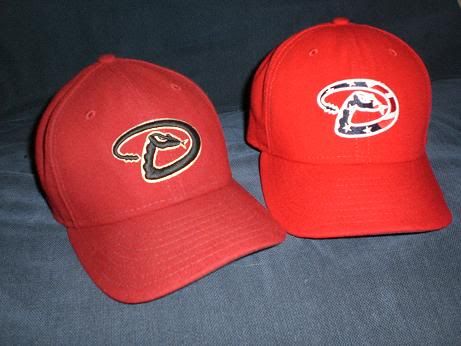
I did however fall victim to purchasing the 2009 cap for the Arizona Diamondbacks, that cap actually doesn't look that bad with the Diamondbacks logo and colour scheme, but the last two years I can't even shake my 4 inch stick at.
Traditional Dbacks New Era vs. Stars and Stripes Dbacks New Era
This year however, I think they just look awful.
The good:
Los Angeles Angels
--Simple and works well for the design, plus it matches the original Angels uniforms.
Seattle Mariners
--Look at how awesome that looks, the stitching is fantastic and works well with Seattle's traditional uniforms.
--fuckin awesome
The Bad:
Atlanta Braves
--Now look at this, can you really even tell that it is an "A"?
St. Louis Cardinals
--Who cares if it matches? Wtf is that shit on the front?
Chicago White Sox
--The letter "S" with a growth below it. Advert your eyes children!
The Ugly:
Toronto Blue Jays
--No.
Florida Marlins
--Oh come on. That fish looks fuckin diseased, they didn't even add a Stars and Stripes design to it, just did a red, white, and blue colour scheme. They should have just done a Chief Wahoo-esque design as the Indians had in 2008, instead this disaster hit the field in 2011.
Detroit Tigers
--All that "thing" on the front reminds me of is the weapon Worf from fuckin Star Trek: Generations.
Coup de Graçe
Mobile BayBears
--My favourite of all of the ugly caps...... A diseased bear.
Subscribe to:
Posts (Atom)