Tuesday, December 20, 2011
Miami Marlins Road
I apologize for not posting in a few days, but I have been doing finals at school and whatnot, now that they are all done I'll have more time to put towards my blog.
As we all know the Florida Marlins are a thing of the past and the Miami Marlins have become the new force to be reckoned with in the National League East. With the change we saw some pretty drastic uniform alterations which completely changed their colour scheme from a Black and Teal oriented scheme to something much more “Miami.”
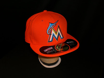
When the caps came out I looked everywhere for them in stores and online, but unfortunately only the flagship stores and local Florida locations were able to get them, and slowly they trickled out to stores such as Lids by November but hit the online MLB Shop stores by October, and through the internet I was able to acquire the Away Cap.
The Away Cap for the Miami Marlins is a base Orange which New Era describes as “Mandarin,” and the logo on the front is one of the few MLB logos to cover quite a large portion of the front two panels. The “M” is in an art deco style which is a solid white raised embroidered “M” outlined with yellow, blue, and orange which is then outlined with a thin later of black and a similar layer of silver. Coming out of the side of the script and raising above it is the Marlin's new incarnation of the fish that is completed with the same silver and black embroidery, but only inverted.
When the Marlins had announced that they were changing uniforms and displayed a few teaser images I can say that I wasn't impressed, but when the final result was leaked I thought it was quite interesting and looked great on a New Era Cap. The Road Cap differs from the home by the base colour only, and personally I think that this cap is just too orange and will be used as either an alternative or retired in a few years; black will be the dominant colour in South Florida.
Labels:
2012,
baseball,
embroidery,
fitted,
hats,
major league baseball,
Marlins,
Miami,
mlb,
new era,
rebranding
Subscribe to:
Post Comments (Atom)


Good post, I was actually thinking about getting one of these (if I had to choose, the Marlins would be my favourite NL team). It's really bright though, that's for sure.
ReplyDeleteAnyways, it's actually worth noting that the logo on the orange hat differs from the black hat a little.
Black: http://www.sportslogos.net/logo.php?id=19vorsmd4og3emfukkimxip9c
Orange: http://www.sportslogos.net/logo.php?id=an0fxuuteq26jiyon0c2ndyfz
Thanks for the comment, Taylor! I had assumed that the colours of the fish would have at least been the same, but the outline doesn't surprise me that they dropped black from the Home cap!
ReplyDeleteI love this cap! Are they ever going to wear it?! I'm getting sick of their black cap already.
ReplyDeleteAlso, these games 3win8 will really make you keener as an individual since you will figure out how to plan and be adequately clever to beat your rival in these games
ReplyDelete